Evaluation Question Two
How effectively is the combination of your main product and ancillary texts?
In this question I will aim to illustrate how effective the combination of these three products were. I will do this by analysing my two posters and articles and relating them to my main product and how a relationship was created and maintained. My main product for my G324 A2 Media OCR coursework was my five minute film, 'And Then We'd Be Happy', this was produced along with two separate posters and articles to create a full quota for a normal independent short film.


When talking of both posters together one can see a few simlarites that run solidly through each of them.
To begin all three characters are used in both. This creates familuarity and realtablity for the audience and the characters. It also means that the barrier of appealing to a certain gender is broken. Whilst the females out weigh the one male, there is a sympathy with that man highlighted in both posters, therefore appealing to the men just as much as women.
Secondly is the font used in the title 'And Then We'd Be Happy' and the tagline 'How close are you to your ex'. This font is a extremly clear theme through both poster and the film itself as it is used for the title credits at the end of the film. Not only this but the font is called 'Apcoloypse' and has taken heavy inspirtation from the font used in the Shaun of the Dead poster. This shows a genre theme throughout all three texts.

1) Example of font used in Shaun of the Dead poster
Incorporating the Cannes Short Film prize on both posters was a choice as it would be the festival of choice for many short films, including my own. Similarly to my decision to include the WARPfilms logo, the Cannes film festival symbol attracts a certain type of audience. One who is not only interested in excellent film making but also supports new independent directors.
The relationship between my main product of my film and the bat poster is clear through, the photograph itself as it illustrates the genre, the Cannes film logo as it illustrates the kind of festival that as a director I would put my film up for and again the kind of nice independent audience I am aiming for.
The relationship between my main product of my film and the bat poster is clear through, the photograph itself as it illustrates the genre, the Cannes film logo as it illustrates the kind of festival that as a director I would put my film up for and again the kind of nice independent audience I am aiming for.
The actual title is also a hint towards the film itself as it is a lyric taken from the song featured twice within the film, The Beach Boys 'Wouldn't It Be Nice'. This hopefully soes a seed within the audience so that when they go to see the film and remember the lyrics of such a well known song there will be a connection made between the title and the music itself. This kind of slightly hidden message creates a realtionship between the audience and the film itself as one feels proud of 'working it out' in a sense.
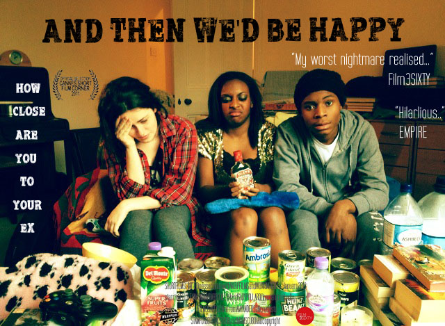
My first poster, referred to as the 'couch' poster.
This image shows the three actors squashed onto a couch with amusing facial expression as they are surrounded by tin cans.
This poster was aimed to evoke the genre of comedy, as I felt the image itself provided the audience with a more humorous idea of the film. This can be seen from the characters expressions and their general body language towards each other. The comedy in the poster reflects part of the hybrid genre of comedy/horror/apocolpse genre that my film is, this means that the genre of the film was continued throughout in the couch poster. As well as this by taking a photograph inspired my a real shot in the film the set and props are exactly as they were in the film. This means that the mise en scene is the same in the film as it is in the couch poster, creating continuity and familiarity with the audience.
For my two posters I was trying to appeal to both genders, as my film reflects true relationships which affect both sexes. However the comedy and overall relateable vibe that the actors give off in my couch poster seemed to resonate slightly more with a female audience. I think this is because this poster seemed to lean more towards a romantic comedy idea. As illustrated below with the couch poster on the left and a traditional example of a romantic comedy poster with three characters. I believe that whilst the comedy is clear there is also an underline current of 'relationships' through the body language of the actors. Therefore hitting a female audience more as they are the target audience for genre films like romantic comedies.


1) Couch poster 2) An example of a romantic comedy poster
The institutions I used were Film3Sixty as 'financial backing' and WARP films as 'partner'. Film3Sixty was taken as inspiration from my research short film Shifter, who was financially backed by the magazine company. Seeing as my film fits the description of a traditional short film, it made sense that a magazine would be supporting the film, as it would not be able to finance itself. WARPfilms would be my ideal film production company, for their representation as one the most successful British independent film companies. Also by including WARPfilms I am hitting a niche audience instantly, an audience who enjoy independently made films, and see themselves as against the mainstream Hollywood studio system made genre films. This means my hybrid genre film would be accepted with this audience.
The two quotes that I used are from the two film magaizines Fim3Sixty and EMPIRE. I used both of these companies as quotes for my film as they both had some link to the production of my final products. Film3Sixy as explained before was taken from my research film Shifter and I used to 'financially' back the film, therefore I felt as a director, if an institution has been so heavily involved in the making of the film, it would probably be quoted on the poster. Secondly was EMPIRE, this was taken from my article that I wrote in the style of the popular film magazine. As EMPIRE is so established in the film industry, I wanted to have a quote to build more recognition with the audience.
The relationship between my main product of my film and the couch poster is clear through, the photograph itself as it illustrates the genre, the film companies shown as they are true to who would hopefully be interested in my film and the audience I am targeting and the quotations used for the same reasons as the film companies.
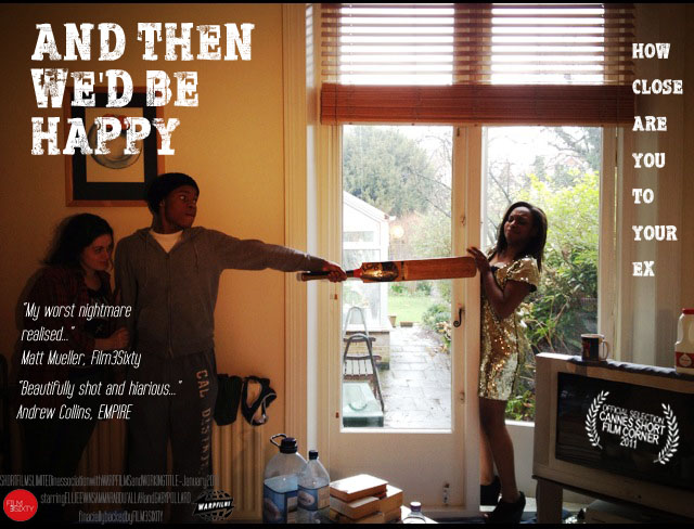
My second poster, referred to as the 'bat' poster.
This image shows the three actors in a more action style shot, as Gaby tries to force entery into the couples home, as they hide away with a bat to warn her off.
I wanted this poster to highlight the horror, apocoplpse side of my film. I felt the image hinted heavily towards the strange situation the characters were in, for example the set and props clearly showing these people have been staying in the same place for some time. The general body language of the characters also shows that the couple are afraid of Gaby for some reason, which intrigues the audience further. All of these elements reflect the horror/apocolpse part of my genre, creating a solid theme throughout. Once again I took the photograph on the base of a shot from the film itself. This again illustrates continuity of mise en scene to the audience. Both posters together also show the only two angles used in the film, so the audience become more familar with this way of viewing the action.
Again I did not aim particularly for a gender when creating this poster as I wanted to appeal to both. However just as with the first the poster became appealing more to one side, this time male. I believe this was due to the action illustrated in the photograph, illustrated below is my poster on the left and an example of a horror/apocalypse style film. One can clearly see the hints at the end of the world, whether that be with the clear empty destroyed landscape or the clutter of supplies to survive littering the room.


1) Bat poster 2) An example of a horror/apocalypse poster
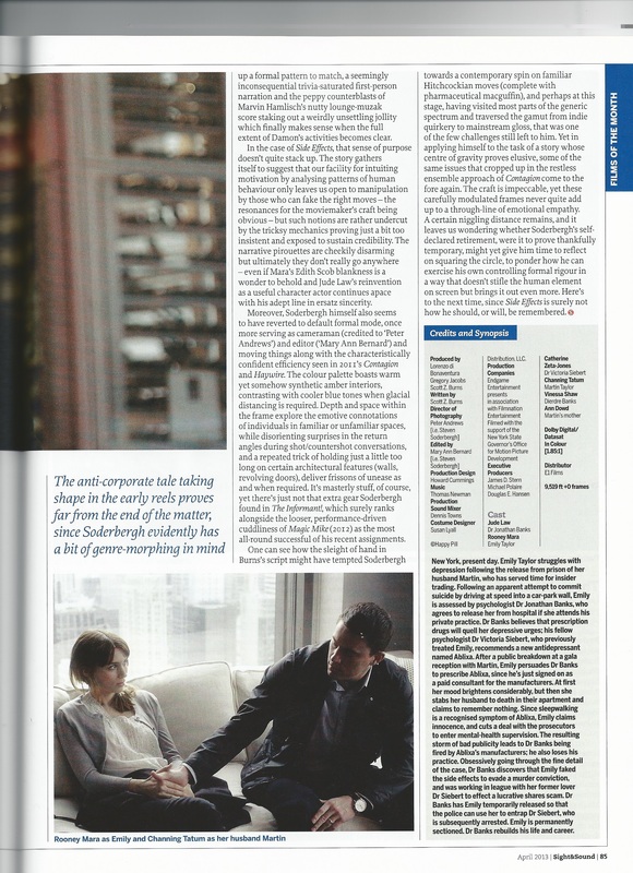
Along with the two posters I also created an article to promote my film. I wanted to keep a strong brand identity intertwined through all of these products. The article took heavy inspiration from the British art-house film magazine Sight&Sound.
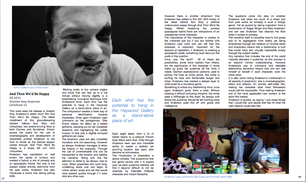
My article
I felt the institution of Sight&Sound, as a magazine that focuses on independent cinema, was the exact market my film would reach. Sight&Sound tends to write articles that reflect film as an artistic expression and as my film does not fit into typical genre categories as it morphs between comedy and apcolopse, it is more a creative endeavour than so much of a commercial success. I kept the writing style mirrored, through a more analytical perspective on the film while focusing more on myself as a director, which is a technique that Sight&Sound used in the research article.
|
|
1) The example research double page article I used from Sight&Sound
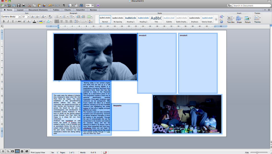
2) How I created the layout of my article in order to relfect the insitution of Sight&Sound
I wanted to keep the layout of the example research article and my own in similar format. I did this through columns, only including two pictures, the font and the pull out quote. This meant that I kept a recognisable theme, so it was obvious which institution my article belonged to. It also kept a brand identity between my film, my posters and my article. As my film is targeted at a niche independent audience, as is my posters, the institution of Sight&Sound and their target reader is exactly the key market for my film. Therefore there is a solid interlink between all three products.
