constructs (fonts and layouts)
1st March Draft One
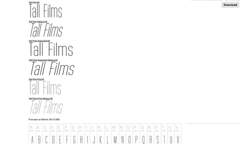
I was recommended by a friend onto the TallFilms font from the website dafont.com for my institutions section on my poster.
When I began experimenting with the font as my title and tagline as well. This I felt made my poster look more professional and the similarities to my research poster, Shifter, seemed more prevalent.
However when I got feedback on it, the point was raised that the font did not reflect the genre of my film. Comparisons were made to the Shaun of the Dead poster, where the font used for the title and tagline mirrored the genre of the film entirely whilst also showing the comedy.
7th March Draft Two
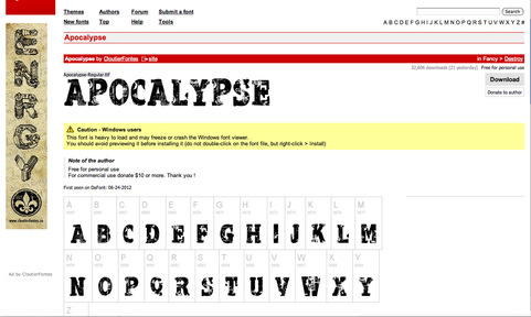
Understanding the feedback given of the fact that my genre was not being communicated effectively through the font, I did some research into possible fonts.
The font I settled on was one called 'Apocalypse' from the website dafont.com. Not only was the name fitting for the genre of my film it reflected the font used in my research film Shaun of the Dead poster. The slight fading and strong lines appealed to me visually and when I incorporated them into my poster the genre instantly became more clear.
The font I settled on was one called 'Apocalypse' from the website dafont.com. Not only was the name fitting for the genre of my film it reflected the font used in my research film Shaun of the Dead poster. The slight fading and strong lines appealed to me visually and when I incorporated them into my poster the genre instantly became more clear.
