mock up 1
1st March Draft One
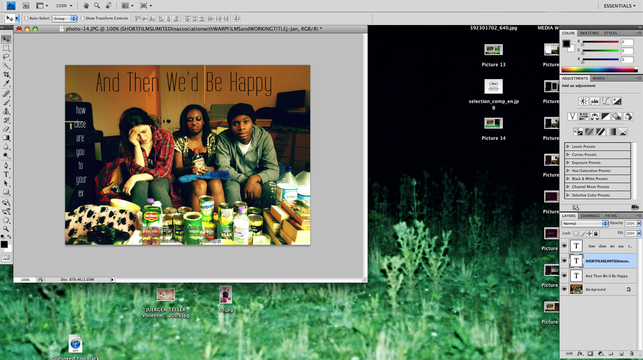
This is the first draft of my film poster. I decided to put my heading at the very centre on the top, taking inspiration from the Moonrise Kingdom poster. I wanted to stick to a black and white font colour theme throughout as they showed best on the busy background. However my institutions paragraph I made a dull grey, so it was easier to read on the multicolour can background. I was given feedback on this poster and told the font did not communicate the genre and I had to include much more, such as critic views and institutions logos.
7th March Draft Two
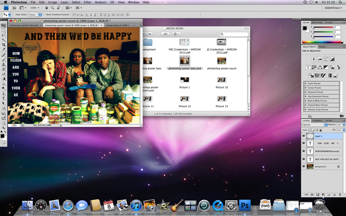
Once I downloaded the 'Apcolpse' font the poster began to take more of a shape and the genre became more obvious. I included a crest from Cannes Short Film Festival, to give it a more realistic feel. I still needed to include my critic quotes.
7th March Draft Three
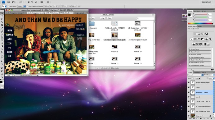
I then brought in some critic quotes, one from Film3Sixty, who I found out from the short film Shifter that I studied. I also used well known film magazine Empire, to create a more professional feel to the poser. I used the TallFilms font on the reviews to create an interesting visual effect so the reader does not get bored by the same font and the information resonates more. The feedback I got on this was more on my institutions paragraph to make that more prevalent and easier to read.
8th March Final Draft
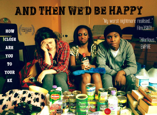
This is my final draft of my film poster. This poster is more directed towards the younger international audience as the genre is more clear in the image of a comedy with a clear hint at apocolpsye horror.
